Navigating Owner Data Insights
Learn how to utilize the Data Insights page to analyze and gain insights into program check-in data
Last updated Over 1 year ago
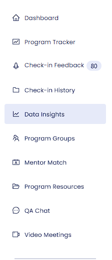
Start by navigating to the data insights page in the navigation bar on the left-hand side of the screen.
You will now see your data insights screen. It may or may not be populated with data from check-ins throughout your program.
Filtering Your Data
Is there too little or too much data to your liking? Notice the filter options on the top of the screen.
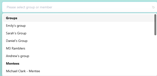
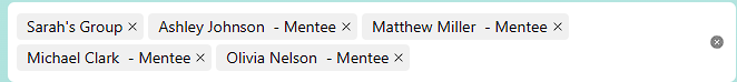
On the top left of the screen is the group/member filter. From here, you can click and select one or multiple groups/mentees to include in your data. To clear these selections, press the x button next to any group or member or the icon on the right side of the filter bar to clear all:
Next, on the top right side of the screen, you will see the other filter for adjusting the date range of the check-in data you would like to include in your data. Clicking on select range will allow you to select from some preset date filters, which work nicely in most cases. By selecting a date range, your data will automatically repopulate with the corresponding check-ins.
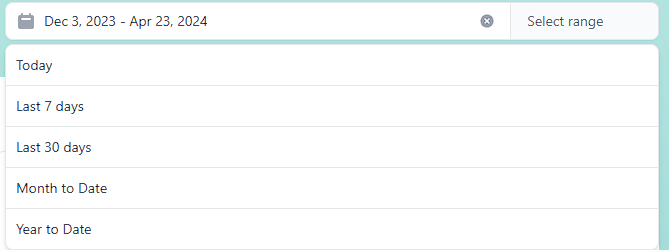
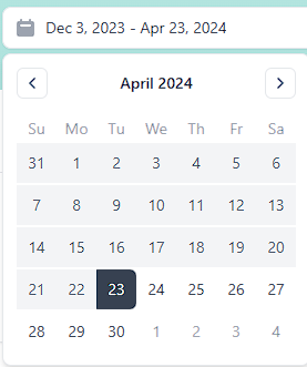
If you need a more specific range of dates, try clicking near the calendar icon on the right side of the filter bar. You will see a calendar where you can select dates to include in your range.
Understanding Your Insights
Engagement Cards
The first section of your data insights page is titled “Engagement,” which focuses on measuring program exploration and completion of tasks. Overall, having a greater number in each of these statistics signifies higher engagement in the program.
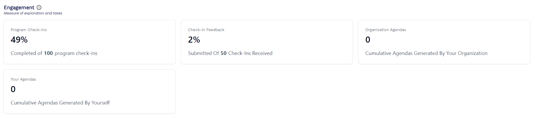
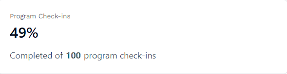
The first card, “Program Check-ins,” focuses on the percentage of assigned check-ins that have been completed by your mentees. It also includes the number of total program check-ins.
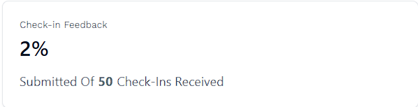
The second card, “Check-in Feedback,” counts the percentage of received check-ins that have had feedback delivered to the mentee. It also includes the number of total check-ins that have been submitted.
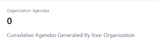
The third card, “Organization Agendas,” counts the number of Cumulative Agendas in the report generator that has been generated by your organization between all mentors. To learn how to generate an agenda, read How to Generate Longitudinal Narrative Reports on Students or Group Cohorts.
The final card, “Your Agendas,” only counts the number of Cumulative Agendas in the report generator that you have generated yourself.
Communication & Mood Graphs
Directly below the engagement section, you will see two graphs.
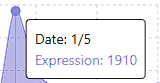
On the left-hand side is the communication graph, which measures the volume of expression in check-ins based on the number of characters inputted. More detailed and lengthy check-in responses result in higher peaks in this graph.
Hover over any point on the graph to get the specific date that the data is being pulled from, and see the number of characters, “Expression,” that is used in the check-in.
NOTE: Although higher character counts usually correlate to greater voice expression and engagement in check-in responses, a lower or higher volume may not directly point to more or less engagement. Sometimes, concise answers can be powerful as well.
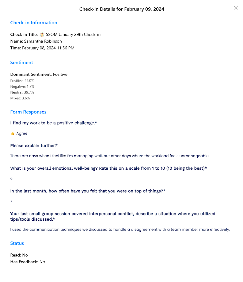
To get more insight into a specific data point, try clicking on any point on the graph. You will see a popup appear with one or multiple check-ins that were submitted on that date. If there are multiple check-ins, they will be organized into dropdowns with the name of the check-in as well as the person who submitted it and at what time.
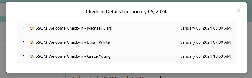
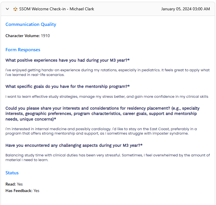
Click on any name to reveal a dropdown menu with the volume of communication in that specific check-in, the exact form responses, and the status of the check-in. Here, you can understand what check-ins are contributing to this data point.
On the right side of the communication graph is the mood graph. This graph works in a very similar way but instead measures the overall sentiment expressed in check-ins on a given day. Sentiment is organized into three categories: Positive, Neutral, and Negative. You will see a corresponding sad, neutral, or happy-faced emoji based on the overall sentiment for that day.
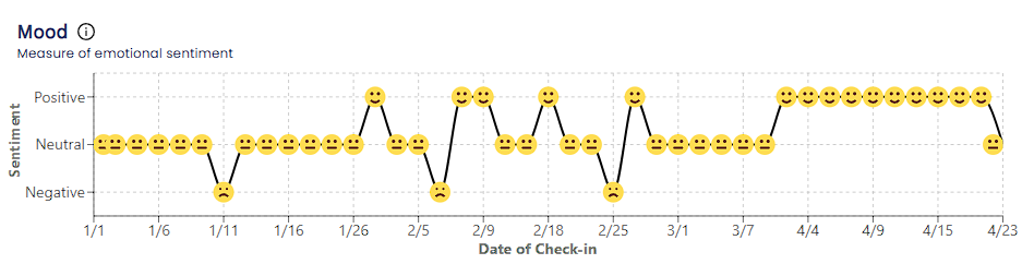
Similarly to the communication graph, you can hover over any data point to see the exact date and sentiment of that point.
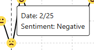
To learn more about a specific point, just like the communication graph, clicking on any given point reveals a nearly identical pop-up menu that organizes check-ins for the day into dropdown menus. The only difference with this menu, is that each check-in will instead include a section for sentiment instead of communication, which shows the breakdown of sentiment detected by the Hume API in the specific check-in. This is how it discerns the overall sentiment for the check-in/day.
Emotions Expressed Graphs
The emotions expressed graphs utilize the Hume API to organize and categorize up to 53 emotional expressions that have been expressed within completed check-ins selected in your filter parameters. These are best to understand the overall emotions being expressed in your program check-ins. To learn more about a specific mentee or group, try adjusting the filters on the top of the screen.
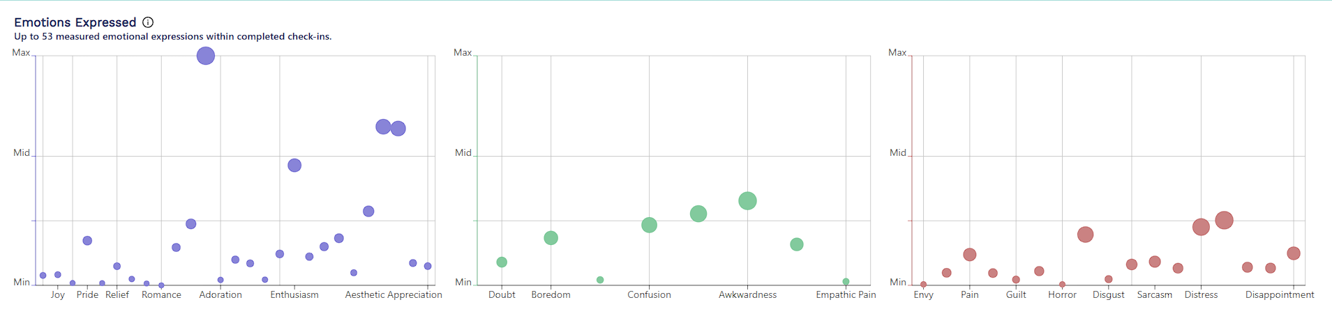
The purple graph on the left represents the most positively correlated emotions, the green graph in the middle represents neutral emotions, and the red graph on the right side represents negative emotions. The emotions on the x-axis of the graphs are organized from left to right as most positive to most negative across all three graphs. The higher up and larger the dots on this scatter plot are, the stronger these emotions have been expressed in the check-ins you have selected in your filters.
You can hover over any dot on the scatter plot to read which emotion is being displayed.
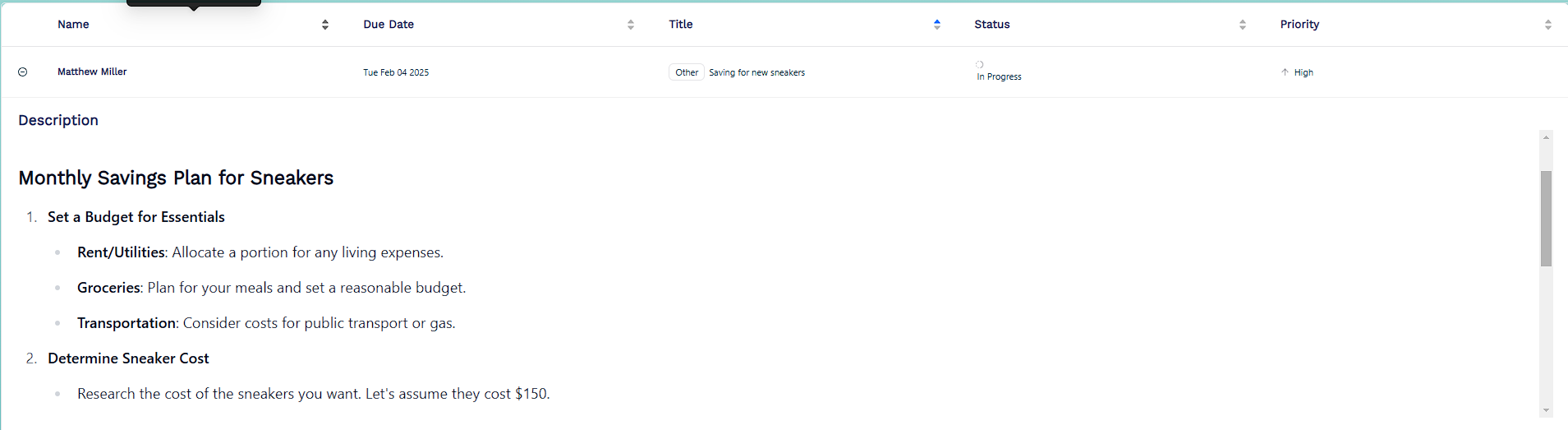
Shared Mentee Action Plans
Finally, at the bottom of the screen is a table for action plan tasks that mentees in your program are currently working on.

You can see the name of the mentee, as well as the due date, title, status, and priority of their specific task in any given row. Try clicking on a row to drop down and read the description of the task that they are working on.
These five sections, as well as the infinite filter customization options, allow for a detailed understanding of the general progress of your program, on both a macro and micro level.